Choosing fabrics for a quilt is something that many people would like to do, but lack confidence for. They are not sure why the colours that looked good in the shop don’t seem to give the result they hoped for.
Personal taste
I would encourage you to make your own choices, and not just to do the same as someone else. Colour is very individual; the same design done in alternative colour schemes can look very different, and express our personality.
Value
In this blog, I am going to concentrate on identifying the value of a fabric (how dark or light it is). This is actually more important than the colour, and is the key to effective choices for traditional style patchwork. All of this guidance is available as a free download; the link is also at the end.
For me, successful quilts are those which show the design clearly. If it’s supposed to be a star, I want to see the star! So, there needs to be enough contrast between the star fabric and the background.
So, for a Two colour design, you could choose:
Dark / Light
or Dark / Medium
or Medium / Light
Remember, this could be a dark design against a light background; or a light feature on a darker background as I have above.
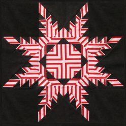
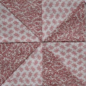
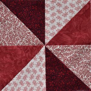
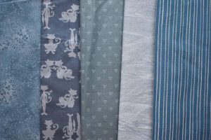
As long as there is sufficient contrast between those for the different parts of the design, then it will work – no matter what the colours! Both of these samples just use red patterned fabrics – but there is enough contrast:
When you look at fabrics, try to decide whether each fabric is Light, Medium or Dark. If that is easy, split the categories down a bit further and include Very Dark; Medium Dark etc.
If you struggle with this, try using a “ruby beholder” – a piece of red glass or plastic to look through.
Photocopying the fabric, or converting a coloured photo to grayscale on the computer using photo-editing software can help too. By removing the impact of the colour, this allows you to concentrate simply on value.
However, particularly in more complex designs, you need more than two fabrics – and wherever they meet, they need to contrast enough to show up.
Three colour
 Dark / Medium / Light
or Dark / Medium Dark / Medium
or Medium / Medium Light / Light
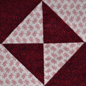
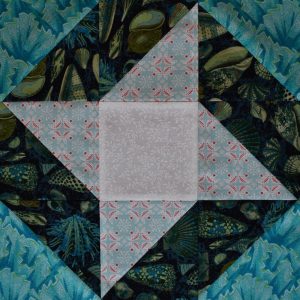
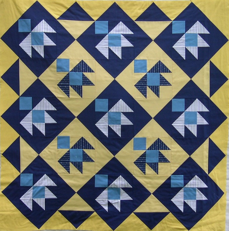
The three fabrics in this Yankee Puzzle block all contrast against each other. It is from my Provencal Sampler pattern, which has fifteen blocks of increasing difficulty. All use just three fabrics, so this would be a good project to practice on. The download pattern, which has 21 pages of detailed instructions, is available in the Shop for £8.
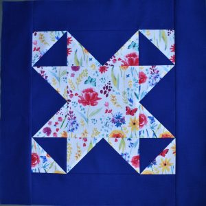
A block which use four fabric values is the Friendship Star shown later – I have a skill-builder pattern for a quillow in this design too.
So, how do you check whether fabrics will work together, once you have identified the value of each (remember, that’s the degree of darkness or lightness)?
Lay the proposed fabrics against one another. Step back, and screw your eyes up a little (or take your usual glasses off!).
Can you clearly see the difference between them? If so, then go ahead and use them!
Pitfalls
Be aware that the fabrics that are instantly most attractive in the shop are often those which have a definite pattern in several colours, and are neither particularly dark nor particularly light. This is so that they look good on their own.
Don’t make the mistake of just choosing these Medium, busy fabrics though – several of this type of fabric together just makes a confusing mess, and doesn’t show up your patchwork design clearly.
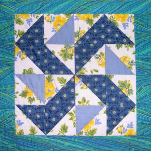
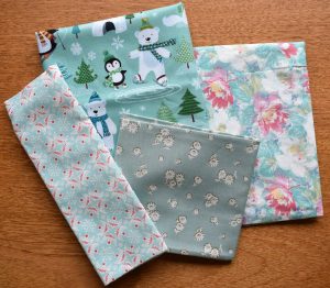
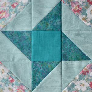
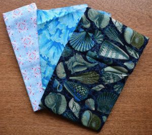
For example, I had these four fabrics all in gentle tones of soft green-blue.
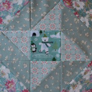
I used them to make a Friendship Star block:
The result is very bland, and the carefully pieced star hardly shows up at all!
You need to have other fabrics which are darker and/or lighter as well, to show up against your Medium fabric.
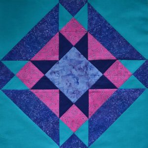
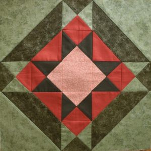
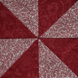
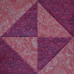
Look at these other three Friendship Star blocks
Can you see how one of the fabrics from the original selection has now been combined with others which provide a better contrast?
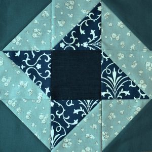
This one is my favourite – it uses classic fabrics to give a cool, calm and sophisticated result.
The second is more modern and vibrant – it’s a bit busy for me, but some of you may prefer it.
Both of these have a big difference between the darkest and lightest fabrics – but if you like a lighter look overall, this can be achieved with fabric choices which still have enough difference between Light and Dark, but where the value contrast is less extreme.
This third Friendship Star is light and fresh, but even the flowery fabric still shows clearly against the very pale mint green, as does the feature star.
Try to develop an observant eye when looking at fabric, making a note of the style that you are looking for, as this will stop you wasting money when shopping! Personally, I hardly ever buy pre-packaged ranges such as Fat Quarter bundles or charm packs, as they usually contain too many Medium values, and don’t include the sort of contrasting fabrics that I want.
Try it out!
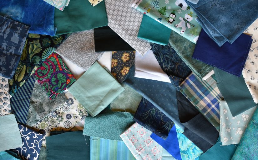
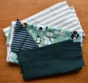
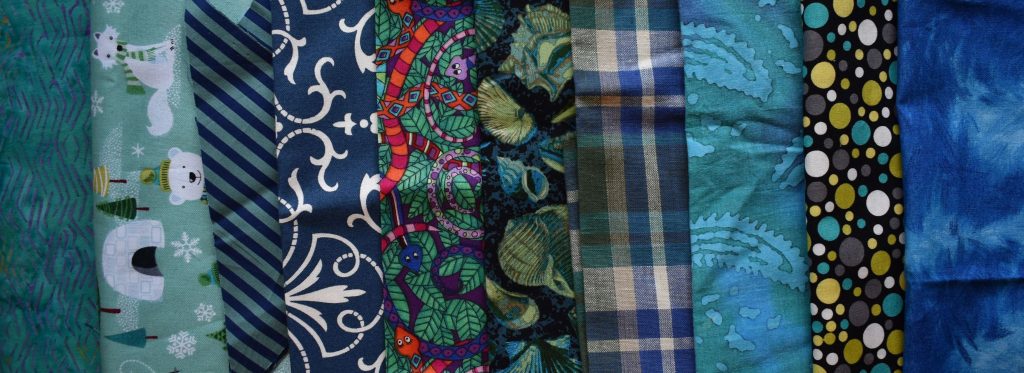
I have found a selection of blue/green fabrics from my stash to show you what I mean – if you have a collection of fabrics, why not pick a colour that you have a lot of, and pull out all of those fabrics to try this out for yourself?
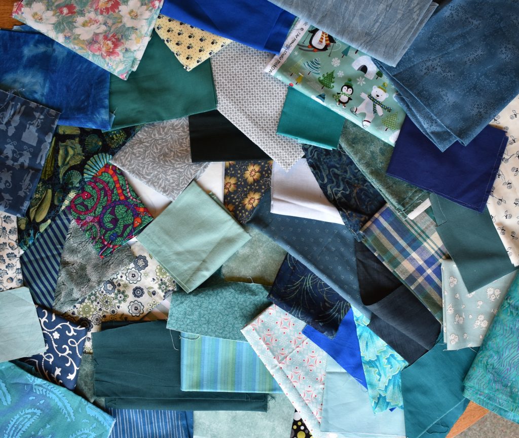
You may find that you have hardly any fabrics in your stash that are very dark or very light, as they look rather boring in the shop by themselves.
How many of the fabrics in my stash would you have walked straight past?

Try to get in the habit of buying much darker and much lighter fabrics as well as the attractive Medium values – they may not look as exciting on the bolt, but will show up your feature fabrics to better advantage.
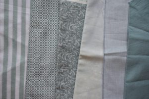
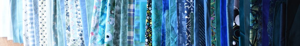
Practice describing colours according to several headings – can you find fabrics in my picture which fit with the following descriptions?
Colour
Don’t limit yourself to “blue-green”.
What sort of blue/green?
Sea green, powder blue, bottle green, navy blue, turquoise, aqua, eau de nil, petrol blue, jade, peacock, grey-green, sky blue
Design
Scale
Large print, small print, plain, mushy blend
Internal contrast
Tone-on tone, busy, multi-coloured
Mood
Bright, loud, muted, pastel, clear, muddy, soft, sombre, rich, faded
Value
Dark, medium, light, pale
Try laying out your fabrics sorted from the lightest through to the darkest. It can be quite revealing – particularly for those highly patterned fabrics!
Selecting fabric
For a particular patchwork block, work out how many different values are needed for your chosen design, and then select fabrics to fit these values.
Lay them against each other to try them out.
Then try others.
Keep trying until you find the ones that work best – a good quilt shop should allow you the time to experiment and think before you buy, even if it does mean twenty bolts of fabric spread out across their table………
Remember that a fabric that behaves as a “Dark” in one colour scheme could be a “Light” in another against much darker fabrics.
Or, you can reverse the colour scheme given on a pattern, so that the Light becomes Dark and Vice versa.
Some “counterchange” designs incorporate both these at once.
The key is contrast. Different value is the most important thing, but complementary colours will also contrast, and a plain fabric is a good choice to show up against a busy pattern.
All of the downloadable patterns that I sell have the fabric requirements listed in terms of Value (e.g. Very Dark, Medium Dark, Medium Light & Light), rather than colour.
This enables you to select fabrics to your own taste that will produce a unique and successful result.
Why not have a look at these patterns in the online Shop?
If you want to take Colour & Contrast further, then have a look at the Scrap Quilts page
A copy of all the information about Colour, Contrast & Scrap Quilts is available as a free download
Or, you could purchase access to a YouTube video workshop, watching Carolyn demonstrate, before trying this out for yourself with your own stash of fabrics.