The greatest need for an awareness of value and contrast is in scrap quilts. Here, instead of just one fabric having a certain value, several, or many different fabrics are selected which have the same value.
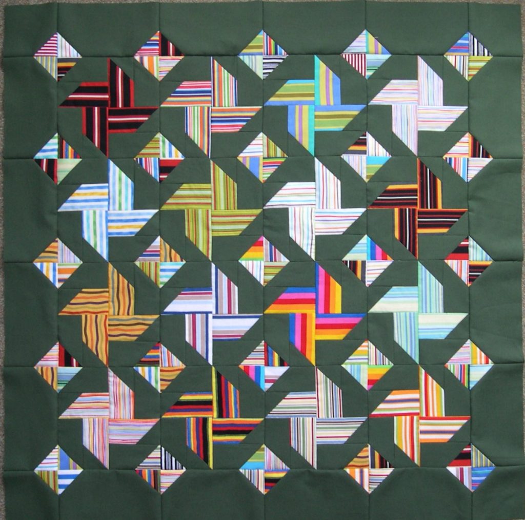
This is a scrappy windmill quilt that I made using a variety of stripy fabrics – all of which were chosen to show up against the dark green background fabric. Most are Light values, with some bright Mediums as well.
This quilt illustrates both a “planned” approach to scrap quilts; all four blades on each windmill are made from the same fabric – and a more random “mixed” scrap approach; each of the smaller diamonds is made up of four different striped fabrics.
Two value design
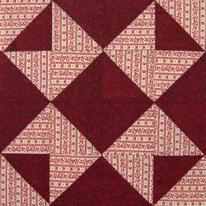
To make a two-value design into a scrap quilt, instead of just one Dark and one Light fabric (as on the Mosaic block shown on the left), you need many different Dark and many different Light fabrics – as in the same design on the right.
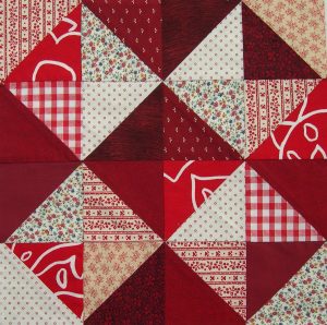
This is why you need to avoid Medium value fabrics – the design won’t show up well enough.
Sorting fabrics
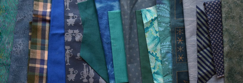
You need to sort out your fabrics, and collect together those which are sufficiently similar in value to “do the same job”. For example, these are all “not-too-busy, Medium fabrics”.
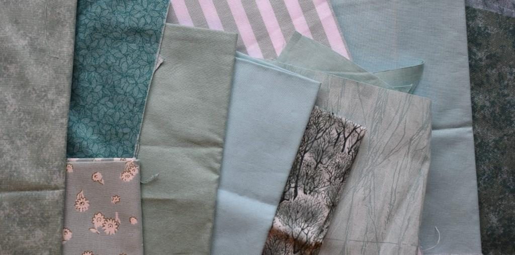
Then collect together a pile of fabrics which “do a different job”, such as these “Light, calm fabrics” below. I could combine both of these sets of fabrics into a “two value” scrap quilt – although I think I would need to take out the fabric at the right-hand end, and possibly the one second in from the left, as the value is too similar to the darker fabrics above. Look at both pictures together – can you see a clear difference?
Log Cabin
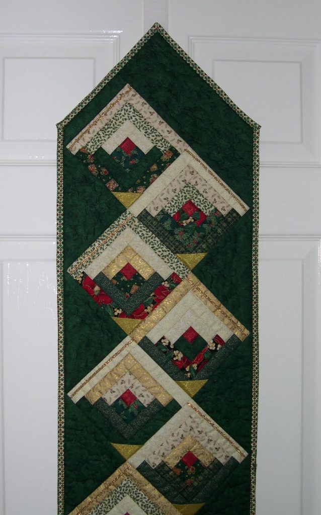
The classic design which uses a selection of scraps of fabric is Log Cabin.
I have placed all the blocks the same way round on my Christmas Card Hanger, but there are many different quilt designs that can be achieved by arranging the blocks in different ways – all of which depend on the difference between the dark and light sides of each block.
The fabric in each block is slightly different, but the overall effect is consistent because dark fabrics are always used on two sides, and Light fabrics on the other two sides.
This pattern is available in my online Shop
Dresden Plate
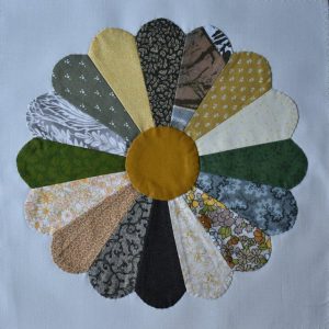
Another scrap classic is Dresden Plate.
To the right is a sample that I made a few years ago – but I can see now that one or two of the “petal” fabrics I chose are really too light. They don’t show up well enough against the background.
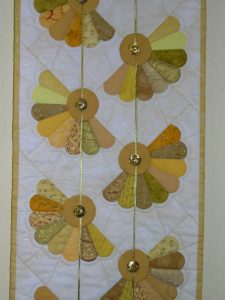
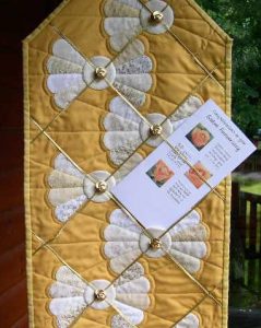
When I decided to make this Celebration Card Hanger for my parent’s Golden Wedding Anniversary, I had to choose the selection of yellow and gold fabrics very carefully – they all had to be dark enough to show up against the cream background; not an easy task with a fundamentally pale colour like yellow!
Thunderstorm
It took months to collect enough suitable fabrics for the Celebration Card Hanger above!
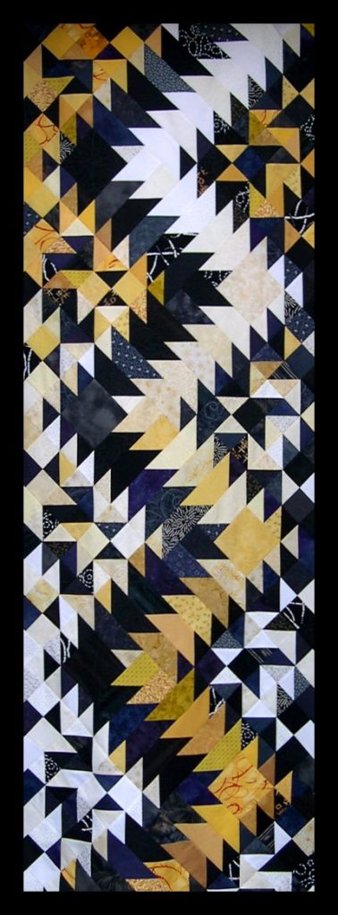
When it was complete, of course I had a large selection of yellow, cream and white scraps of fabric left over.
These came in when I was asked to create a quilt for the “In the Spotlight” competition in 2007 at the Festival of Quilts.
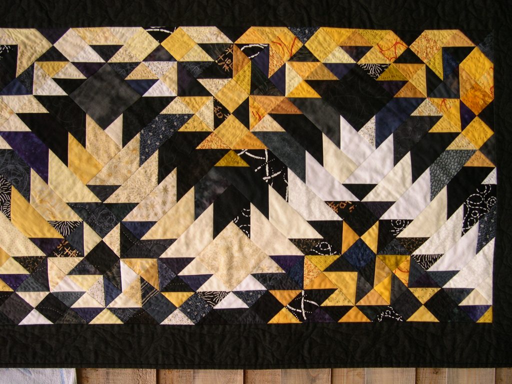
The theme was “August”, and after a lot of head scratching, I decided to make “Thunderstorm”
My design required carefully placing the fabrics by value:
- going from deep yellow through to white up the zig-zag
- going from deep yellow to white going down the fragmented patterns at the edges.
To achieve such careful grading of colours required laying it all out on a sheet on the living room floor, and swapping round the many different small units that I had made until it looked right.
My family got very fed up of walking round it…………..
The close-up below shows many of the fifty or so different fabrics which went into this project:
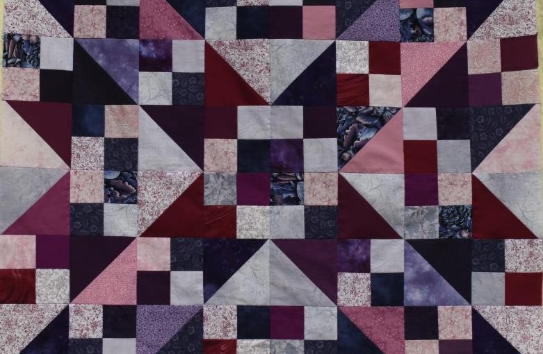
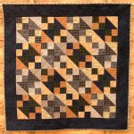
Another of my favourite scrap quilts is Solitaire – click on the small image to see more photos of this bed quilt.
Any patchwork design can be done as a scrap quilt.
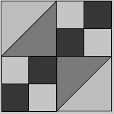
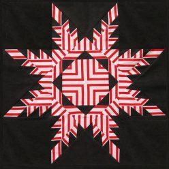
This simple Northern Lights block uses two Light and two Dark values.
Shown here is one little scrap quilt which uses this block.
Click to see several different scrap quilts which also use this little block.
Of course, many scrap quilts don’t use such carefully planned colour placement.
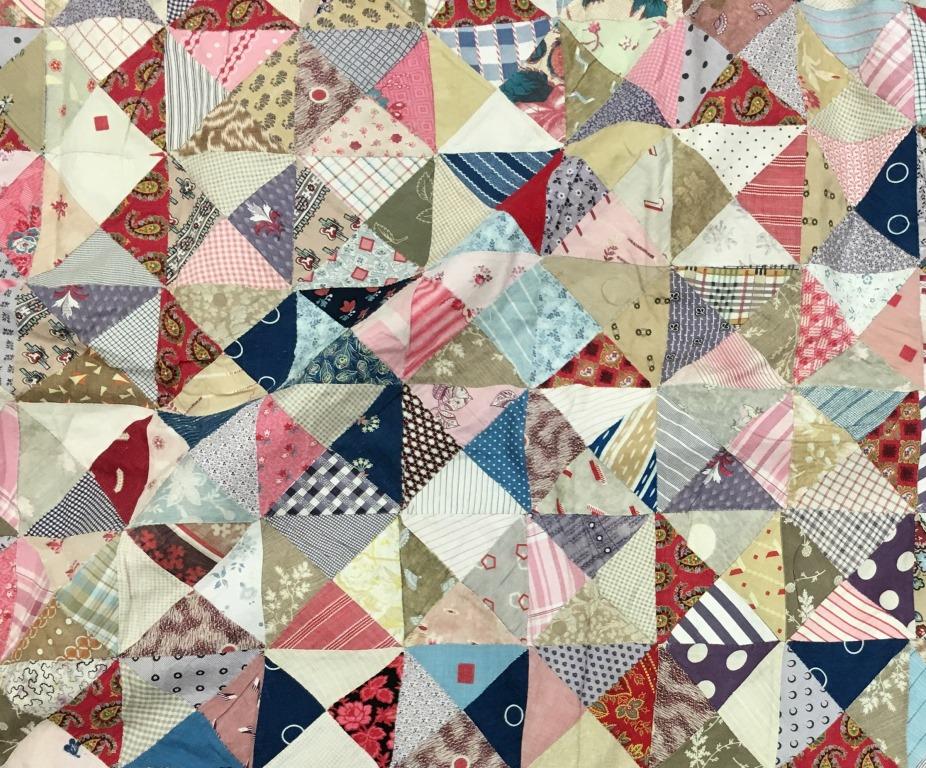
This cheerful scrap quilt was made by Harriet Yeatman in the late nineteenth century. If you like antique quilts, why not look at others in my Collection?
Even this apparently random selection does not include every possible colour. When you make scrap quilts, rather than a complete mixture, I would suggest that you too try to decide on a family of colours and a common mood – this will give a more coherent feel to the design.
All of the information included on this Scrap Quilt page, and on the Colour & Contrast page is included in a free download for you to keep and refer to.